What is Brutalist Web Design?
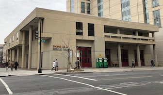
The term brutalism is often associated with Brutalist Architecture, however it can apply to other forms of construction, such as web design. This website explains how.

The term brutalism is derived from the French béton brut, meaning “raw concrete”. Although most brutalist buildings are made from concrete, we're more interested in the term raw. Concrete brutalist buildings often reflect back the forms used to make them, and their overall design tends to adhere to the concept of truth to materials.
A website's materials aren't HTML tags, CSS, or JavaScript code. Rather, they are its content and the context in which it's consumed. A website is for a visitor, using a browser, running on a computer to read, watch, listen, or perhaps to interact. A website that embraces Brutalist Web Design is raw in its focus on content, and prioritization of the website visitor.
Brutalist Web Design is honest about what a website is and what it isn't. A website is not a magazine, though it might have magazine-like articles. A website is not an application, although you might use it to purchase products or interact with other people. A website is not a database, although it might be driven by one.
A website is about giving visitors content to enjoy and ways to interact with you.
The design guidelines outlined above—and detailed below—all are in the service of making websites more of what they are and less of what they aren't. These aren't restrictive rules to produce boring, minimalist websites. Rather these are a set of priorities that put the visitor to your site—the entire reason your website exists—front and center in all things.
Detailed Guidelines for Brutalist Web Design
Below is a detailed look into each of the guidelines listed above. As with all artistic constraints while you may find them frustrating, you should also find them inspiring.
Content is readable on all reasonable screens and devices.
Most websites exist to deliver content for you to consume, either words (such as on this site), or images, such as on Pinterest. To be true to that nature, the content must be readable in all browsers. Some screens are very large, while others are very small. Some browsers, such as screen readers, have no screen at all.
By default, a website that uses HTML as intended and has no custom styling will be readable on all screens and devices. Only the act of design can make the content less readable, though it can certainly make it more. For example, this website does not use default styles, yet, it is readable on any size screen.
Only hyperlinks and buttons respond to clicks.
A website is a hypertext document that allows for two primary forms of interaction: navigating a link to another location, and submitting information back to a server. These functions are performed, respectively, by hyperlinks and buttons.
Although JavaScript allows any element to respond to a click, websites are not applications, and the vast majority of websites should have no need to resort to such heroics in order to allow the visitor to navigate or submit data. Further, clickable areas of a page that are not obviously hyperlinks or buttons can confuse the visitor, causing them to perform unwanted actions or miss links entirely.
To trick or deceive the visitor goes against the nature of a website, which is to deliver information and interact honestly with a visitor.
Hyperlinks are underlined and buttons look like buttons.
As mentioned when discussing clicks, only hyperlinks and buttons should respond to clicks, since this maintains an honest and transparent interaction with a visitor. To maintain a truth to materials, it follows that the appearance of these elements should also be honest and clear.
A hyperlink has no analog in the real world. Since the dawn of the web, convention dictates a hyperlink use an underline to reveal its existence (which is a wonderful solution, since underlining has no place in modern typesetting). Because of this convention, there is no clearer indicator of more content than a bit of underlined text.
Buttons, however, do have an analog in both the real world and computer programs. The browser being a computer program, it stands to reason that buttons rendered in a browser should look like buttons rendered on the computer operating system running said browser. With no effort at all, this is precisely what happens. See for yourself:
Note: this is not a real form
This button is unambiguous, both in its function and its difference from a hyperlink. Where a link promises more information for the visitor, a button agrees to submit the visitor's information to the server. Hiding this interaction behind a hyperlink or unadorned text betrays the core nature of a website.
That said, the default visual appearance of a button is often unpleasant or clashes with the visual language of the site. Fortunately, many forms indicate button-ness to a visitor, and it's often trivial to style a button to both match the visual language of a site while also looking eminently pressable. Here is an example of a site using a yellow color scheme and serifed fonts that has an obvious button:
Note: this is not a real form
Notice also that the form elements are true to themselves. An operating system has a visual language for collecting input from a visitor, and a Brutalist Web Design stays as close to that as possible.
The back button works as expected.

All browsers have a built-in button called the back button. This button is a form of “undo”, taking the user back to where they were before their last navigational click.
To break this core and enduring feature of the web requires a confluence of design and programming (such feats would be better applied to smoothing the experience of going back after a form submission). It also requires either ignorance of (or contempt for) the site visitor, as the back button is often their only means of undoing an errant click.
View content by scrolling.
A website is neither a book nor a magazine. Because it's viewed in a browser, users can scroll the browser's viewport to read content that can't fit on one screen. This mechanism works beautifully and allows visitors to read content without the interruptions caused by clicking and page-reloading (also note that all browsers are able to scroll properly and don't need any assistance from JavaScript).
While long-form content may require navigation and multiple pages, there's rarely need to artificially paginate articles, blog posts, or other medium-length content simply to satisfy advertisers or inflate engagement numbers.
Scrolling also allows the visitor to consume content at their pace using a method they prefer. Like the back button, this can only be broken by intentional design and careless implementation. Advertisers need not suffer from scrollable content, however.
That was an ad for one of my books. It was clearly marked, and easy to scroll past while you continue to read this site. It might not be the most creative way to place an advertisement amongst the text, but it demonstrates clearly that the visitor's core need to easily consume a site's content need not be at odds for that site to sell advertising.
Decoration when needed and no unrelated content.
A website is neither an application nor a video game. It is for content, and so its design must serve that purpose. Being true to these materials need not imply a boring website or require that all sites look the same.
For example, on large screens this section has a pull quote with a washed blue background, a different text font, and an emoji! While this design employs decoration, it's not distracting (though the pull quote is distracting on a small screen, which is why it's not shown to those visitors).
Decoration for its own sake, often to satisfy the vanity of the designer, goes counter to Brutalist Web Design. Such needless decoration distracts the visitor from the reason for visiting and makes the content secondary.
The same can be said of unrelated content, such as misleading links, sensationalist headlines, or distracting images. These all attempt to take the visitor away from the content either for advertising or to create a false increase in engagement. Effort should be spent on compelling content, not trickery. Content drives engagement.
Performance is a feature.
Websites aren't physical like a book or magazine. Their contents must be downloaded over a computer network and then rendered in a web browser. This takes time, but visitors are accustomed to this (up to a point).
Consider that the entirety of Pride and Prejudice by Jane Austen is 708 kilobytes. To download this much data using a very slow mobile connection would be around one second (try it for yourself by reading it on Project Gutenberg). Pride and Prejudice is over 200 pages long, and would take almost six hours to read. Certainly a news article, tweet, or product catalog can be downloaded and rendered in a comparable amount of time to a novel.
The good news is that by adhering to the other guidelines, your website will download and render quickly. By embracing its nature and materials, a website adhering to Brutalist Web Design is fast. It allows the system of network, browser, content, and operating system to work together smoothly and efficiently, as they were designed to. Even with decoration, advertising, and imagery, a website embracing Brutalist Web Design will respect your visitor's time, bandwidth, and battery.
Embrace Brutalist Web Design Permalink
How much better would the web be if every site embraced Brutalist Web Design? How amazing would it be to have readable text, clearly-marked interaction points, unobtrusive advertising, all wrapped up in a fast-loading site you could consume using the native tools of your chosen device?
A friend gave me design advice once. He said to start with left-aligned black text on a white background, and to apply styling only to solve a specific problem. This is good advice. Embrace this, and you embrace Brutalist Web Design. Focus on your content and your visitors will enjoy you and your website. Focus on decoration or tricking your visitors into clicking ads, and your content will suffer, along with your visitors.
Here are some specific tips:
- Understand the semantic meaning of HTML elements.
- Learn about typography.
- Try designing for a small screen by default.
- Learn from designers about the choices they made and why they made them.
- When in doubt, do what Tron does: fight for the users.